14 Real-World Project Management Dashboard Examples by Function and Industry
Explore 14 examples of different project management dashboard layouts that show real-time data to track aspects like project status, resource utilization and project success.
A project management dashboard is a data visualization tool that can help monitor and track project progress. It summarizes key data and metrics to provide insights into workloads, deadlines, budgets and resource utilization in real time. The best project management software allow you to create different kinds of dashboards for varying needs.
However, it can be a bit challenging to understand how to build a dashboard and use it effectively. In this article, we’ll look at 14 real-world examples of project management dashboards categorized by function and industry. We’ve also explained how you can create the dashboard yourself using different project management tools.
The first set of dashboards covers specific purposes, such as monitoring KPIs, project health and financials. The second group is for different industries, like construction, HR and software development. You can use these examples as a starting point to create dashboards for your unique needs.
| PROJECT MANAGEMENT DASHBOARDS BY FUNCTION | PROJECT MANAGEMENT DASHBOARDS BY INDUSTRY |
|---|---|
| Focus on specific project processes or tasks (e.g., finance, time, KPIs) | Tailored to meet the unique needs of a particular industry (e.g., software, construction) |
| Best for teams who want to focus on KPIs and metrics | Best for readers looking for industry-specific examples |
| Shows how to visualize key project processes | Shows how dashboards adapt to industry workflows |
| → Jump to Dashboards by Function | → Jump to Dashboards by Industry |
7 Dashboards by Function Examples
In this section, we’ll showcase some dashboards we created to assist with different project functions, such as tracking project health, financials and more. They’re designed to provide insights to project managers, supporting data-driven decision-making and planning.
Avoid Costly Project Management Mistakes – Get Free Tips Today!
- Discover 10 fundamentals of project management
- Understand step-by-step plans for PM execution
- Learn tips to avoid 5 common mistakes by beginners
1. Project Reporting Dashboard
How Does This Dashboard Layout Work?
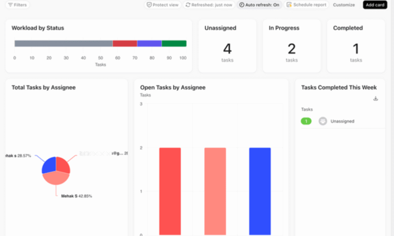
This basic project status dashboard gives a clear, real-time snapshot of the project’s status. The top row highlights key metrics such as task progress, unassigned work and completed items. This makes it easy to see how the project is tracking at a glance. Visual elements like the “workload by status” bar indicate where most of the tasks are sitting in the workflow.
The lower section has pie and bar charts to show task distribution, which can help identify team members who may be overloaded or underassigned. By combining visual summaries with raw task counts, the layout makes it simple to monitor progress, spot issues early and keep everyone aligned without needing to analyze detailed reports.
2. Project Health Dashboard
How Does This Dashboard Layout Work?
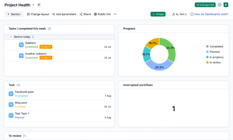
This dashboard gives project managers a quick overview of task status and overall project data. At the top, it highlights tasks completed during the week, making it easy to track recent accomplishments. The donut chart in the “progress” section breaks down all tasks by status, so you can instantly gauge how balanced the workflow is.
The lower half of the dashboard shows active tasks and those that are waiting for review, as well as any workflows that have been interrupted. These are important indicators of bottlenecks or delays. This layout is especially useful for managers or teams who need a fast, visual health check of the project without digging into detailed reports.
3. Project Issue Tracker Dashboard
How Does This Dashboard Layout Work?
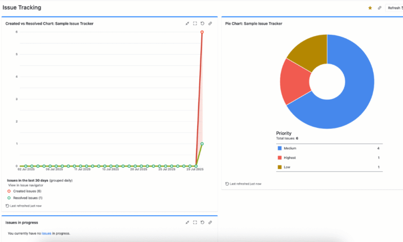
This project management dashboard offers a snapshot of issues and priorities. The “created vs resolved” chart on the left instantly shows whether the team is keeping up with incoming issues, so it’s easy to spot a recent spike in unresolved problems. This helps you identify bottlenecks before they become critical.
On the right, the “priority” pie chart breaks down issue types by urgency, helping teams focus on what matters most. For instance, in the above chart, project managers would see that one issue is marked as “highest” priority, allowing them to allocate resources accordingly.
4. Project Financials Dashboard
How Does This Dashboard Layout Work?
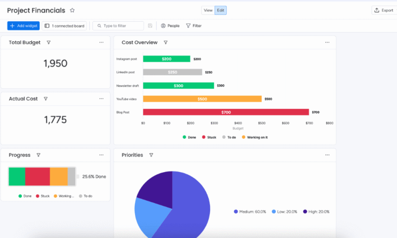
This dashboard summarizes essential budget-related insights. The top-left section compares the allocated budget with the actual cost. The “cost overview” bar chart in the center breaks down expenses by task, enabling you to spot which deliverables are consuming the most of your budget, along with their current status (e.g., done, stuck, to do).
Meanwhile, the “progress” battery serves as a handy snapshot of task completion. The “priorities” pie chart in the bottom right helps managers understand task weights based on urgency or importance, so they can reallocate resources if needed. Altogether, this dashboard strikes a balance between numbers and visuals, summarizing key financial data.
5. Project KPI Dashboard
How Does This Dashboard Layout Work?
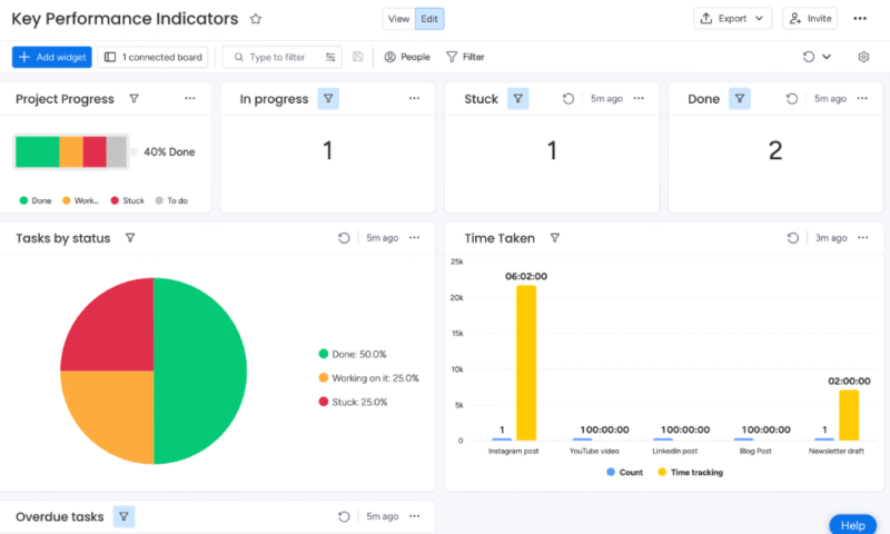
This visual layout showcases overall project progress, task distribution, bottlenecks and time tracking, which are all essential for performance monitoring. The combination of color-coded charts and individual status counters helps identify where the team stands and highlights areas that need attention, such as “stuck” tasks.
The left-hand battery widget shows the project completion percentage, and the time-tracking bar chart at the bottom is useful for evaluating effort across content types. Therefore, this dashboard is ideal for a content marketing or creative team tracking both productivity and task health.
6. Risk Management Dashboard
How Does This Dashboard Layout Work?
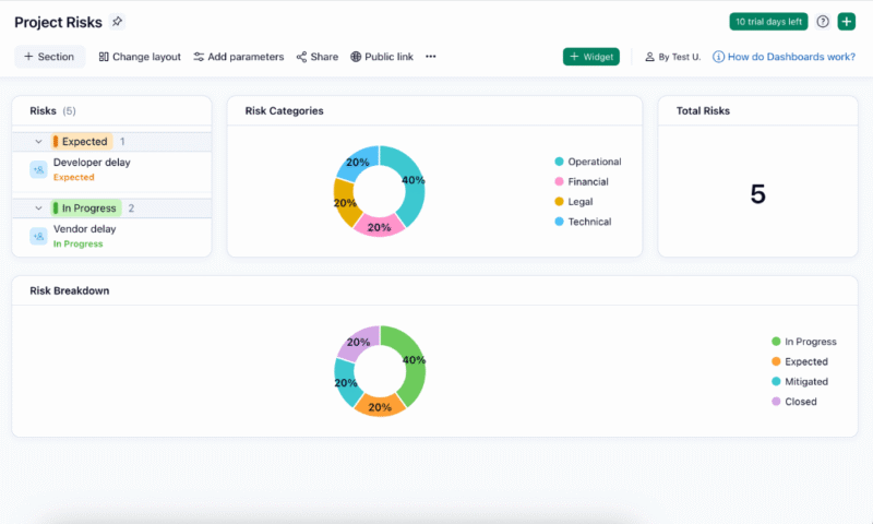
This dashboard offers a comprehensive yet easily digestible overview of project risks. The left panel lists individual risks by status, making it easy to track progress and updates. Meanwhile, the “total risks” widget provides a quick summary of the number of risks that are currently logged.
The two donut charts in the center and bottom break down risks by category and status, helping teams and stakeholders quickly assess the overall risk landscape. This layout balances detail and readability, so it’s ideal for regular reviews and real-time decision-making.
7. Employee Time-Tracking Dashboard
How Does This Dashboard Layout Work?
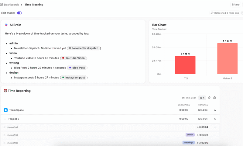
This dashboard provides insights into team productivity and potential time sinks. The first section categorizes time entries by task type — such as admin, video, writing and design — to reveal overall work patterns. This data can help decision-makers allocate resources efficiently and coach employees toward better time management.
The right side of the dashboard complements this information with a bar chart showing the total time tracked per user, allowing you to easily compare workloads across the team. Below that, the “time reporting” section tracks estimated vs actual hours, highlighting discrepancies to improve future planning.
7 Dashboards by Industry Examples
The sample dashboards in this section are tailored to meet the unique needs and challenges of specific sectors like software development, construction and HR. These dashboards provide relevant metrics, workflows and visualizations that align with industry standards, helping teams stay organized, compliant and efficient.
1. Software Development Dashboard
How Does This Dashboard Layout Work?
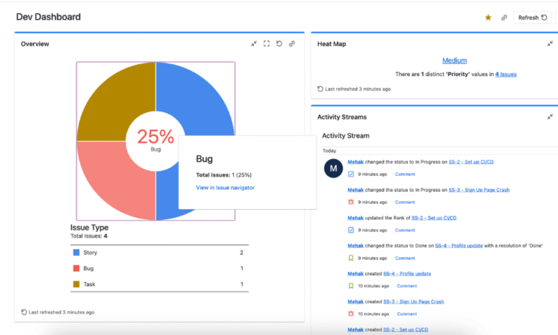
This dashboard is designed to address the fast-paced, iterative nature of Agile development. It provides a real-time overview of ongoing work with a clear breakdown of issue types visualized through a pie chart. This helps project managers and developers identify what type of work is dominating the sprint and adjust priorities if necessary.
The heat map of issue priority levels further allows the team to identify critical tasks quickly while minimizing the risk of blockers going unnoticed. On the right, an activity stream captures recent updates, such as status changes and new issues. This section highlights the latest actions taken to maintain transparency and aid collaboration.
2. Construction Project Dashboard
How Does This Dashboard Layout Work?
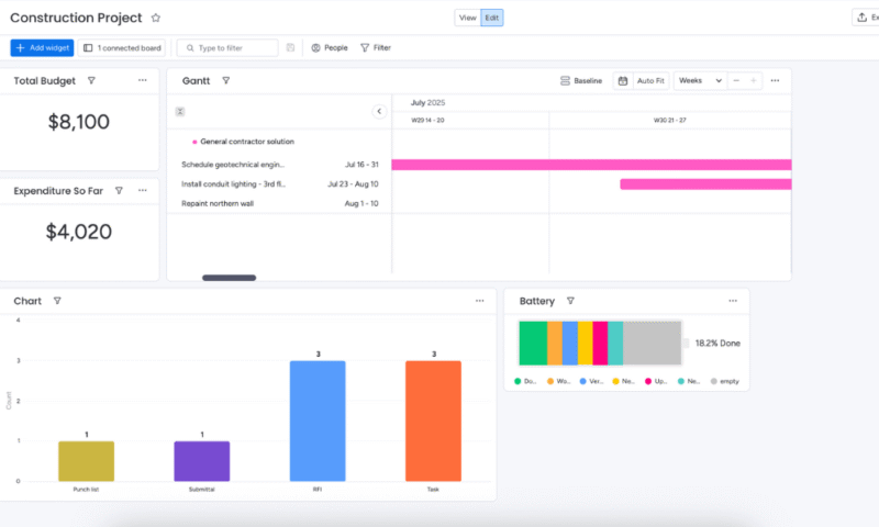
This layout summarizes key project metrics in one place. The Gantt chart at the top offers a clear timeline of tasks like geotechnical scheduling, conduit lighting installation and wall repainting, making it easy to track task durations and overlaps visually. This allows project managers to monitor scheduling dependencies and make adjustments if delays arise.
Below the Gantt chart, the dashboard shows the total budget and expenditure so far, giving an instant snapshot of financial health. The bar chart visualizes the task type distribution, while the “battery” widget provides a color-coded view of the task status or stage. Together, these components help stakeholders assess both the project’s schedule and progress.
3. Business Development Dashboard
How Does This Dashboard Layout Work?
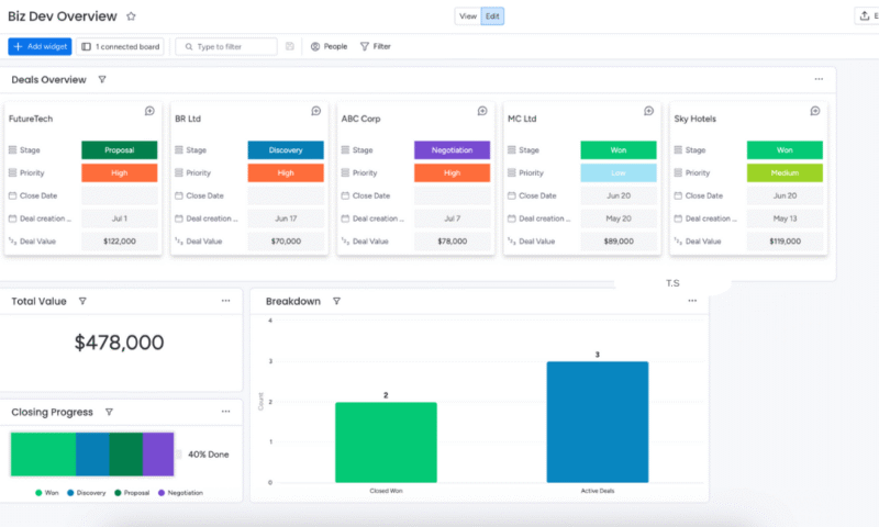
This dashboard offers both high-level business intelligence insights and granular deal tracking. At the top, the “deals overview” section provides a summary of ongoing and completed deals, allowing business development teams to quickly determine where each deal stands in the pipeline and identify which ones need urgent attention.
The color-coded stages — like “proposal,” “discovery” and “won” — also add visual clarity. Moreover, the “total value” widget shows the overall potential revenue, while the “closing progress” bar tracks how far the team has progressed in converting leads into wins. Lastly, the “breakdown” chart compares the active and closed deals for more strategic planning.
4. HR Management Dashboard
How Does This Dashboard Layout Work?
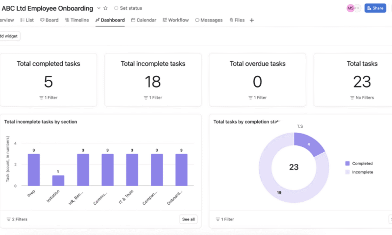
This dashboard example provides a visual overview of the onboarding process for new employees. The top row gives a snapshot of key performance metrics to reveal the current progress of onboarding. The bar chart breaks down the incomplete tasks across different stages.
Lastly, the donut chart further complements this by showing the ratio of completed to incomplete tasks. Overall, this layout works well because it combines simplicity with functionality. It provides a summary of the onboarding progress along with section-specific breakdowns that can support better decision-making and workflow optimization.
5. Product Development Dashboard
How Does This Dashboard Layout Work?
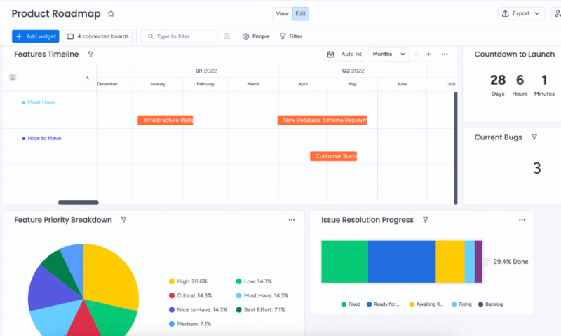
This dashboard provides key information like feature timelines, priorities and issue resolution progress in a clear, digestible format. The color-coded Gantt chart helps teams understand development stages and deadlines at a glance, while the pie chart and progress battery provide insights into feature priorities and task completion rates.
The “countdown to launch” and “current bug count” widgets keep urgent tasks front and center, while the feature status breakdown — such as “fixed,” “backlog” or “ready for review” — allows teams to monitor workflow efficiency. Overall, the dashboard is visually clean and easy to understand at a glance, offering real-time insights for stakeholders and team leads.
6. Sales Performance Dashboard
How Does This Dashboard Layout Work?
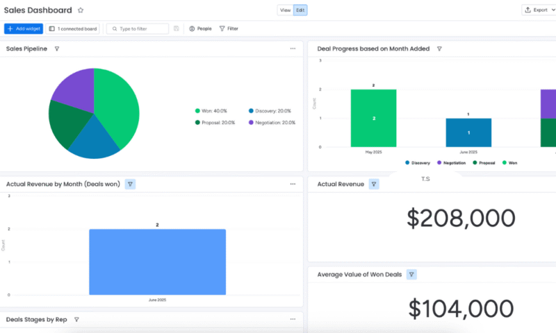
The dashboard offers metrics on the progress of deals through various stages, the volume and value of closed deals, and individual team contributions. The summary widgets at the top highlight critical KPIs such as the total revenue, number of deals won and targets met, giving an instant snapshot of progress.
Down below, the bar and pie charts break down data by sales reps, deal stages or regions, helping managers identify top performers and areas that need attention. The easy-to-read visual layout is ideal for daily check-ins and high-level reviews. It provides clarity, actionability and strategic alignment for fast-paced sales environments.
7. Marketing Dashboard
How Does This Dashboard Layout Work?
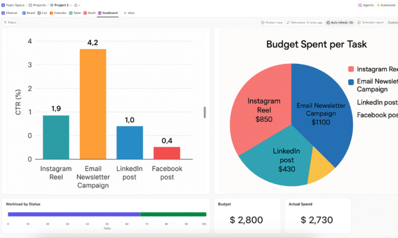
This marketing project dashboard presents key performance and financial metrics in a clear, engaging manner to support quick decision-making. On the left, the bar chart highlights the click-through rate (CTR) across different campaign channels to indicate which marketing methods are most effective.
The color-coding helps differentiate each campaign, making it easy to interpret performance data at a glance. On the right, the pie chart provides an intuitive overview of the budget allocation per task. This comparison between spend and performance is essential to convey the return on investment (ROI) for each channel to marketing teams and upper management.
What Is the Best Way to Create a Project Management Dashboard From Scratch?
Dashboards are among the key features of most project management platforms, though they’re usually not included in free project management software plans. Some tools provide customizable templates for building a good project dashboard.
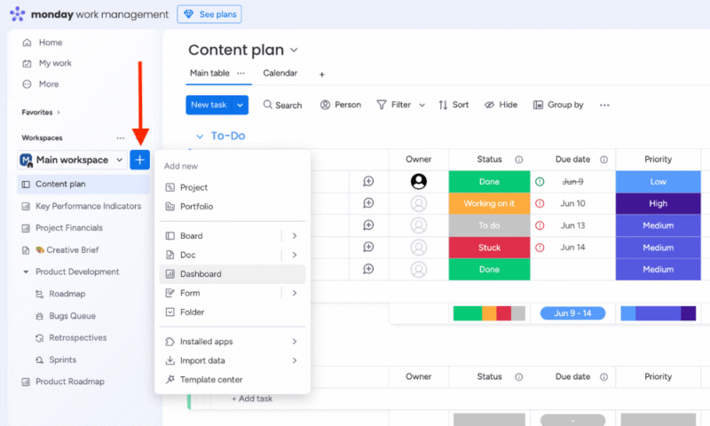
We’ll use monday.com as our example in this guide, but the process will be similar for other tools. Once you get started with monday.com, you can follow the steps below to build a dashboard.
- Create a New Dashboard
Click the “+” icon in the left pane and select “dashboard.”
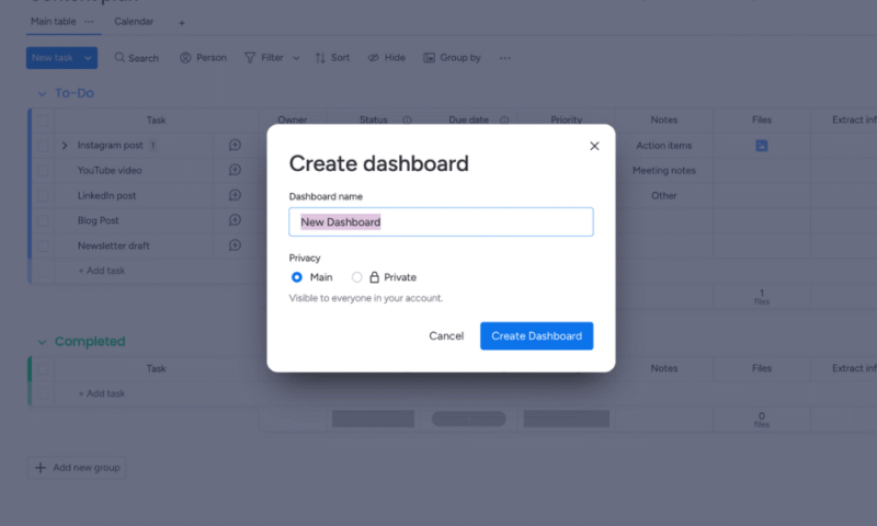
- Name the Dashboard
Name your dashboard, such as “Executive Project Dashboard” or “Project Status Dashboard.” Choose whether to make it “private” or “main” (accessible to everyone in the workspace). Then, click the “create dashboard” button.
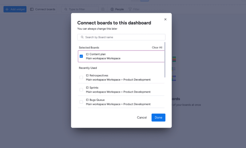
- Connect Boards to the Dashboard
You’ll be prompted to select the boards you want to connect. These are the data sources that will feed into the dashboard. Select one or more relevant boards and click “connect boards.”
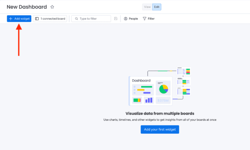
- Add Widgets
To customize your dashboard, click “add widget.” Select a widget type, such as “chart,” “numbers” or “battery.” Click “more widgets” to see the full range of options.
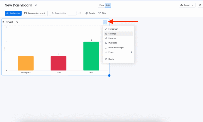
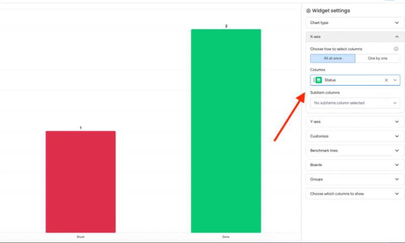
- Access the Widget Settings
monday.com will automatically create the type of widget you select. To customize or configure it, click the three-dot menu and choose “settings.”
- Customize the Widget
In the widget settings, you can configure your options including: data settings, like which columns to use; group filters, such as showing only “active” campaigns; date filters; and visualization styles.
You can repeat all the above steps to add more widgets to your dashboard that reflect important metrics from your workflows. You can also drag and drop the widgets to rearrange your dashboard as you like.
Final Thoughts
A project management dashboard makes it easy to track key project metrics while managing multiple projects. It offers real-time data that can help managers and other stakeholders make informed decisions to optimize resources and efficiency. They can be used for a multitude of purposes and are fairly straightforward to set up.
Do you have any questions about dashboards? What kind of dashboards will you be using for your projects? What do you think are the most important metrics for your team? Feel free to share in the comments below. Thank you for reading.
FAQ: Project Management Dashboard Examples
A project management dashboard is a visual overview of important project metrics like task completion, project milestones, budget tracking and resource allocation. It can help project teams make data-driven decisions.
You can create dashboards using most project management software like monday.com, ClickUp, Asana and Jira. Choose the option to create a dashboard, then add widgets that display specific information from your project boards and files.
A PMO (project management office) dashboard is a visual tool that displays key metrics like project status, resource allocation, budget performance and risks. It helps management teams and executives monitor different projects and make informed, strategic decisions.


